Clock Chart, Length and Color Modified by Numeric Variables
Source:R/clock_chart_qnt.R
clock_chart_qnt.RdThis function will plot time of events on a 24 hour clock to show which events took place at what times. The length and color of the hands are modified according to a numeric vector.
Arguments
- data
A data frame
- time
Time in 24 hours. The allowed time formats for these family of charts are
HH:MM:SS,HH:MMor evenH:M(such as12;30:09or9:3).- len
The numeric vector by which hands will be modified and colored.
- Col
Optional. A numeric vector to change color. This option will be discontinued.
- high
The color name for the high values. The default is
red.- low
The color name for the low values. The default is
green. The color names can be vice versa or other colors, depending on the context. To use a single color for all lines, use same value forhighandlow.
Details
Change the title, subtitle or the caption of the plot with
ggplot2::labs() .Change the legend title by adding
ggplot2::labs(color = "TITLE 1", size = "TITLE2").
Add
or modify legend by theme(legend.position = "POSITION"); the valid
position names in ggplot2 are top, bottom, right, and left,
excluding more complex options.
See also
clock_chart_col() for coloring by a numeric variable,
clock_chart_qlt() for coloring by a qualitative variable,
clock_chart() for the simplest clock chart
Examples
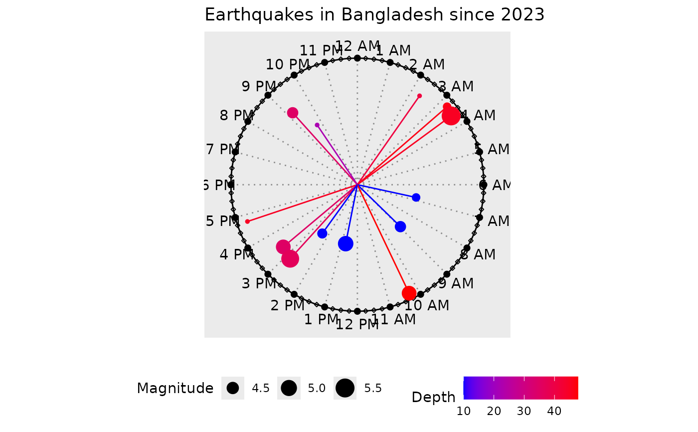
p1 <- clock_chart_qnt(
  data = bdquake, time = hms, len = depth,
  Col = mag, high = "red", low = "blue"
)
p1 + ggplot2::labs(
  color = "Depth", size = "Magnitude",
  title = "Earthquakes in Bangladesh since 2023"
)