This function will plot time of events on a 24 hour clock to show which
events took place at what times. The hands are colored by a
qualitative (factor) vector.
Change the plot's title, subtitle, or caption using ggplot2::labs().
For example: ggplot2::labs(title = "My Plot", subtitle = "My Subtitle")
You can change the title of the legend by adding ggplot2::labs(color = "Legend Title").
See also
clock_chart_col() for coloring and clock_chart_qnt() for more options.
Examples
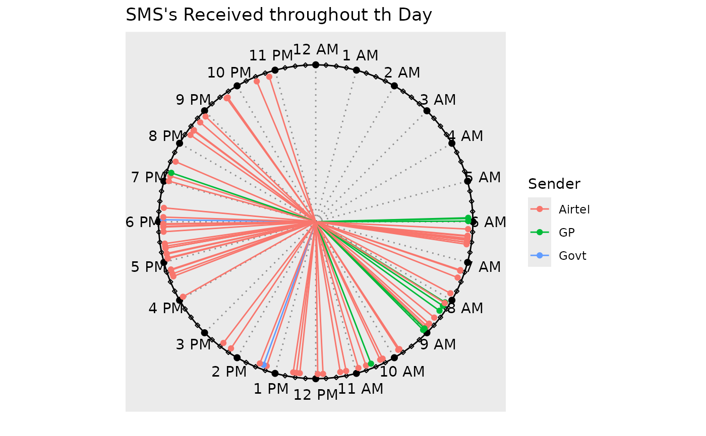
# A plot showing sms receiving times based on
# criteria (type/sender/invoked)
clock_chart_qlt(smsclock, time = time, crit = sender) +
  ggplot2::labs(color = "Sender", title = "SMS's Received throughout th Day")