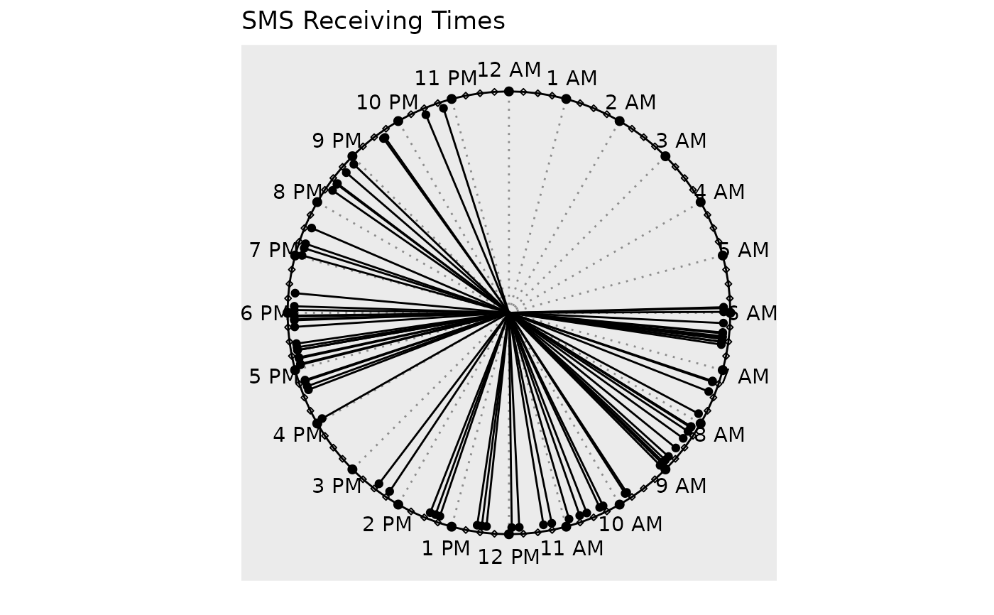
There are five types of clock charts, clock_chart() being the simplest one.
It just shows the event times on a 24 hour clock. The lines are neither
colored, nor length modified. clock_chart_col() is used to colorize and
clock_chart_len() to change the length of the hands by a numeric vector.
To do both simultaneously, use clock_chart_qnt(). To use a qualitative
variable as the criterion, use clock_chart_qlt().
Details
Change the title, subtitle or the caption of the plot with
ggplot2::labs().
Examples
p1 <- clock_chart(smsclock, time) # Using package built-in data
p1 + ggplot2::labs(title = "SMS Receiving Times")

#  Add clock_chart(brintcity %>% filter(Origin == "Dhaka"), time = Departure)