This function plots values corresponding to random periods such as hours, days, months and so on.
Arguments
- df
A data frame
- Period
A list of periodical values such as hours of the day, days of the week, months of the year and so on.
- Value
A numeric vector with the values corresponding to the
Period- crit
A factor variable based on which the bars would be colored.
- ColV
A character vector with the list of colors for the bars. You can use this online tool (https://r-charts.com/color-palette-generator/) to create a beautiful color palette.
Details
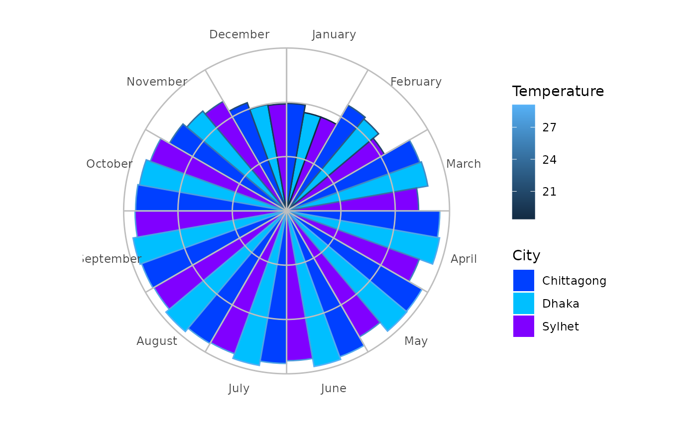
This can plot values corresponding to multiple categories, for example, temperature in different cities on the days of a week, or rainfall by month in a year.
See also
day_chart() for plotting values on a day by hours,
week_chart() for plotting values in a week by days,
year_chart() for plotting values in a year by months
Examples
# Using package built-in bdtemp data
Col <- c("#0040ff", "#00bfff", "#8000ff")
cyclic_chart(bdtemp,
  Period = Month, Value = Temperature,
  crit = City, ColV = Col
)